
After years of being stored away, I discovered that my mother had hidden a hoard of my old artworks in the upstairs closet in Grandma Aldrich’s house (now my parents’ house).
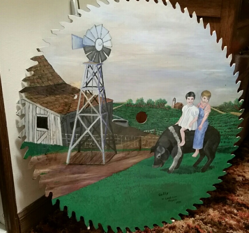
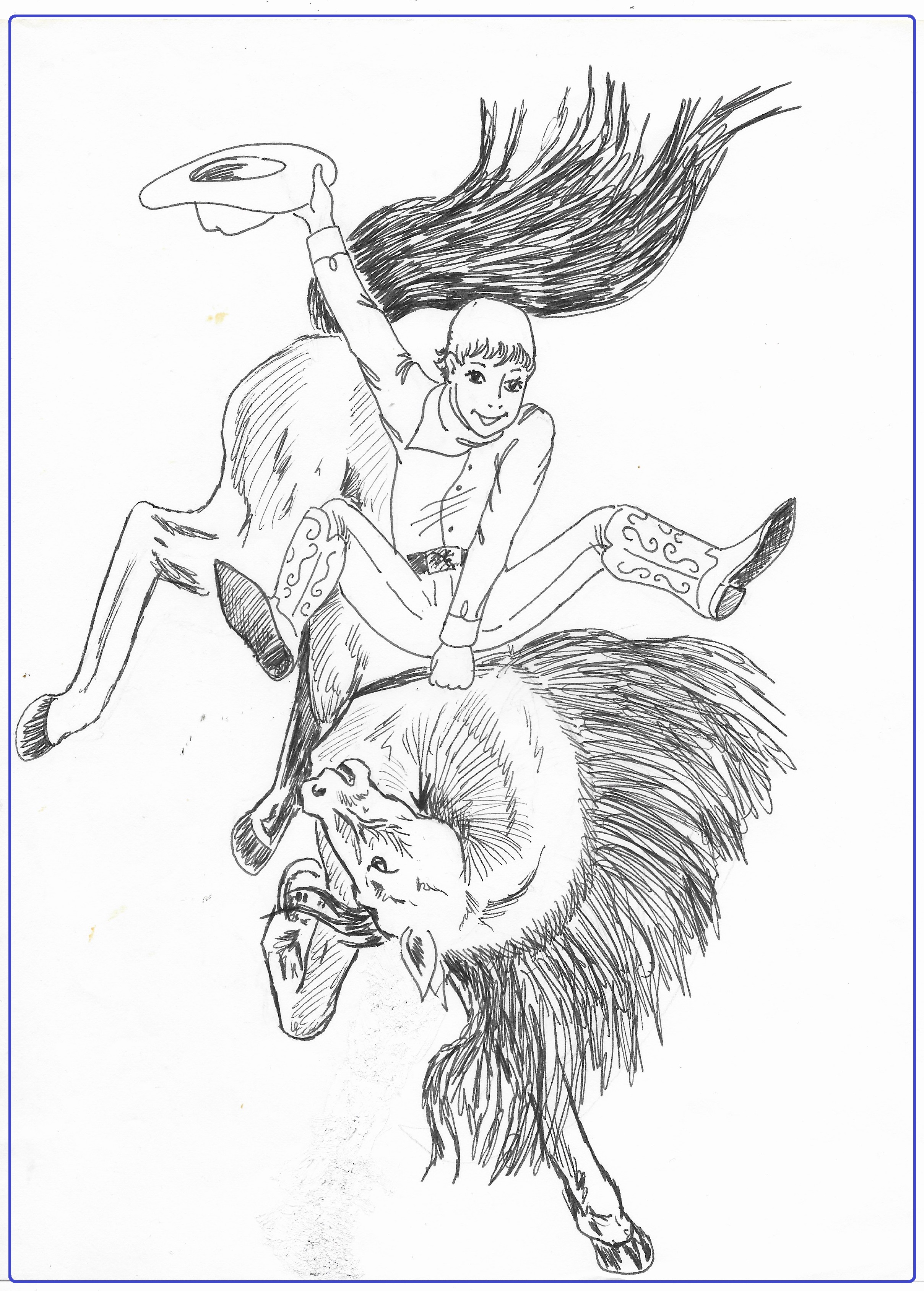
This oil painting was done on an old saw blade at the request of my Grandpa Aldrich. He wanted a farm painting on it, like the one he’d seen in a restaurant during a fishing trip in Minnesota. I chose as the subject Sally the pig. Sally was a hairlip piglet that had to be bottle fed and raised in a box by the stove until later in life she became a favorite pet. Believe it or not, pigs are smarter than the family dog. She became a pig you could ride. And Grandma had taken a precious old photo of my mother and Uncle Larry riding the pig. I used that photo to make this painting. It was also the painting I wanted to find on this trip to Iowa. Searching for it led to finding all the others.
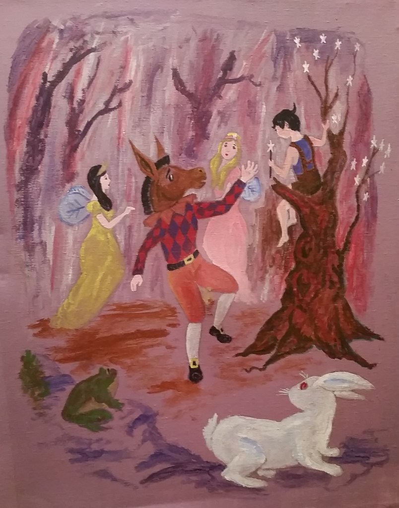
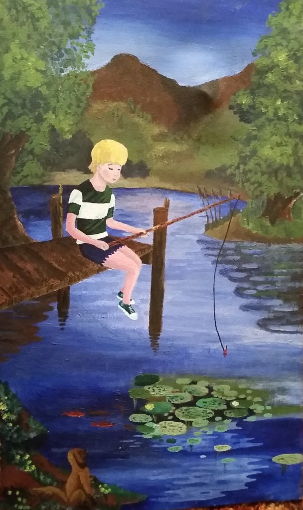
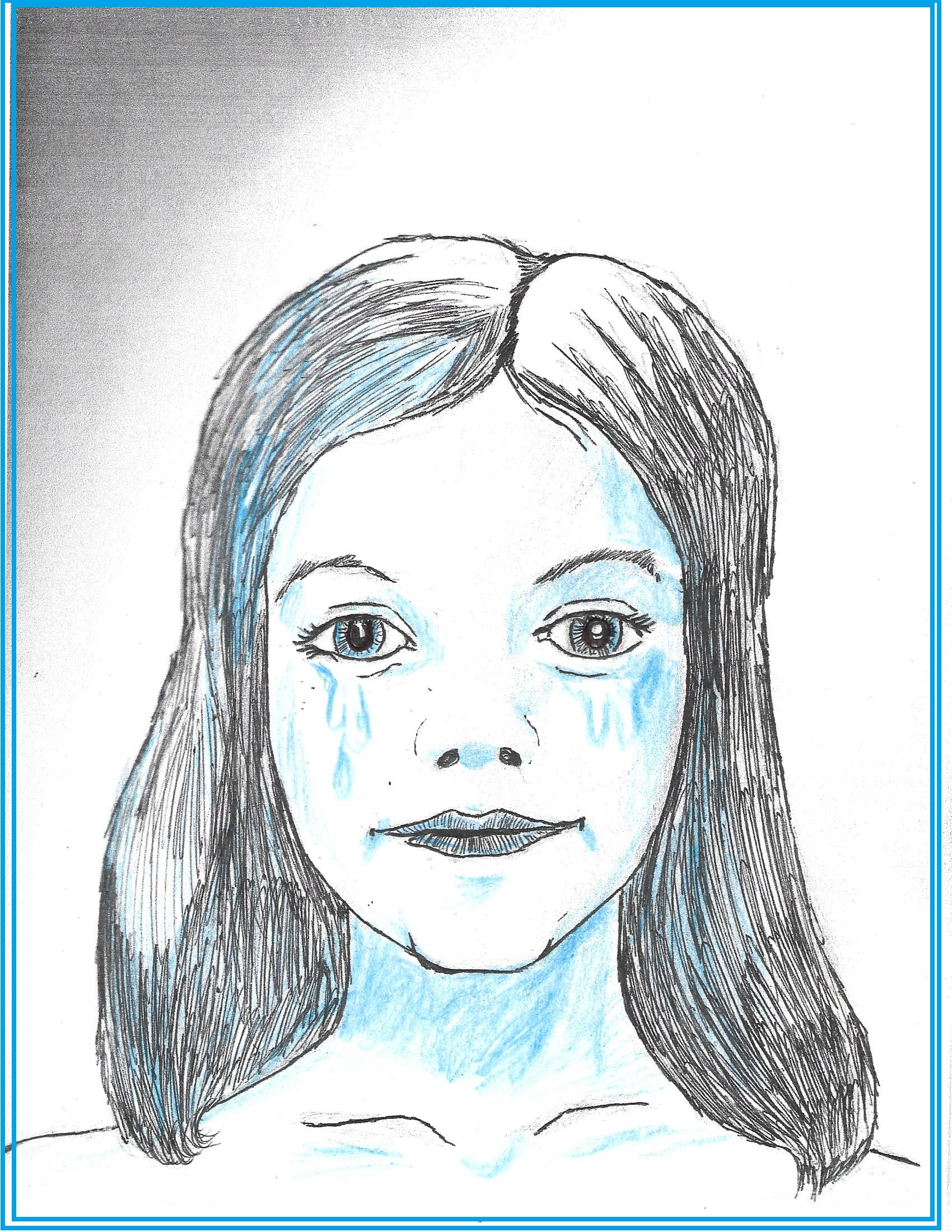
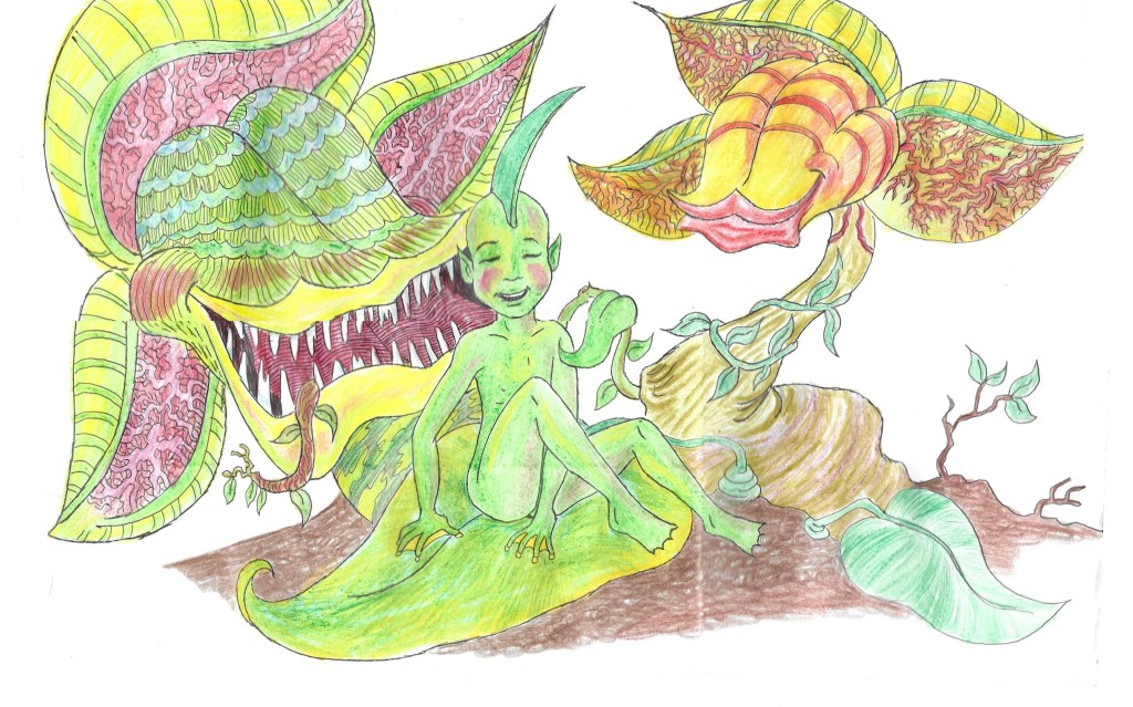
These two are among the earliest paintings I did. They were both done on canvases that I stretched over the frame myself in high school art class. The purple one is a scene from Shakespeare’s Midsummer Night’s Dream. The blue one doesn’t have a title, but you can see what it is. It is an ancient shibboleth water monster lurking under a dock, fishing for young boys to eat.
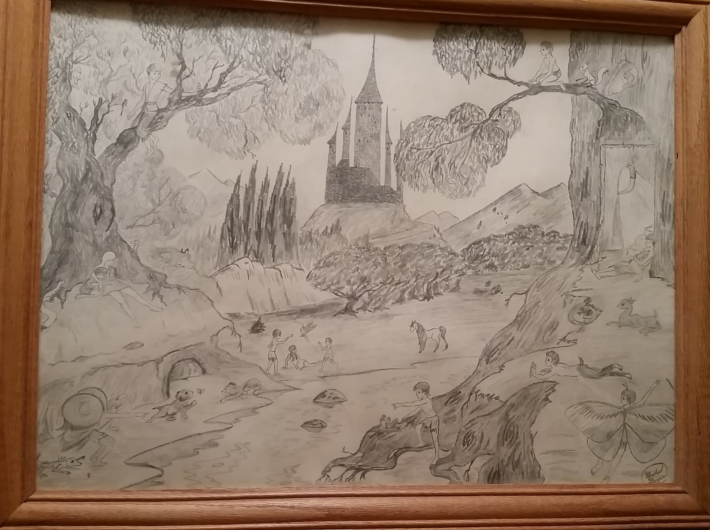
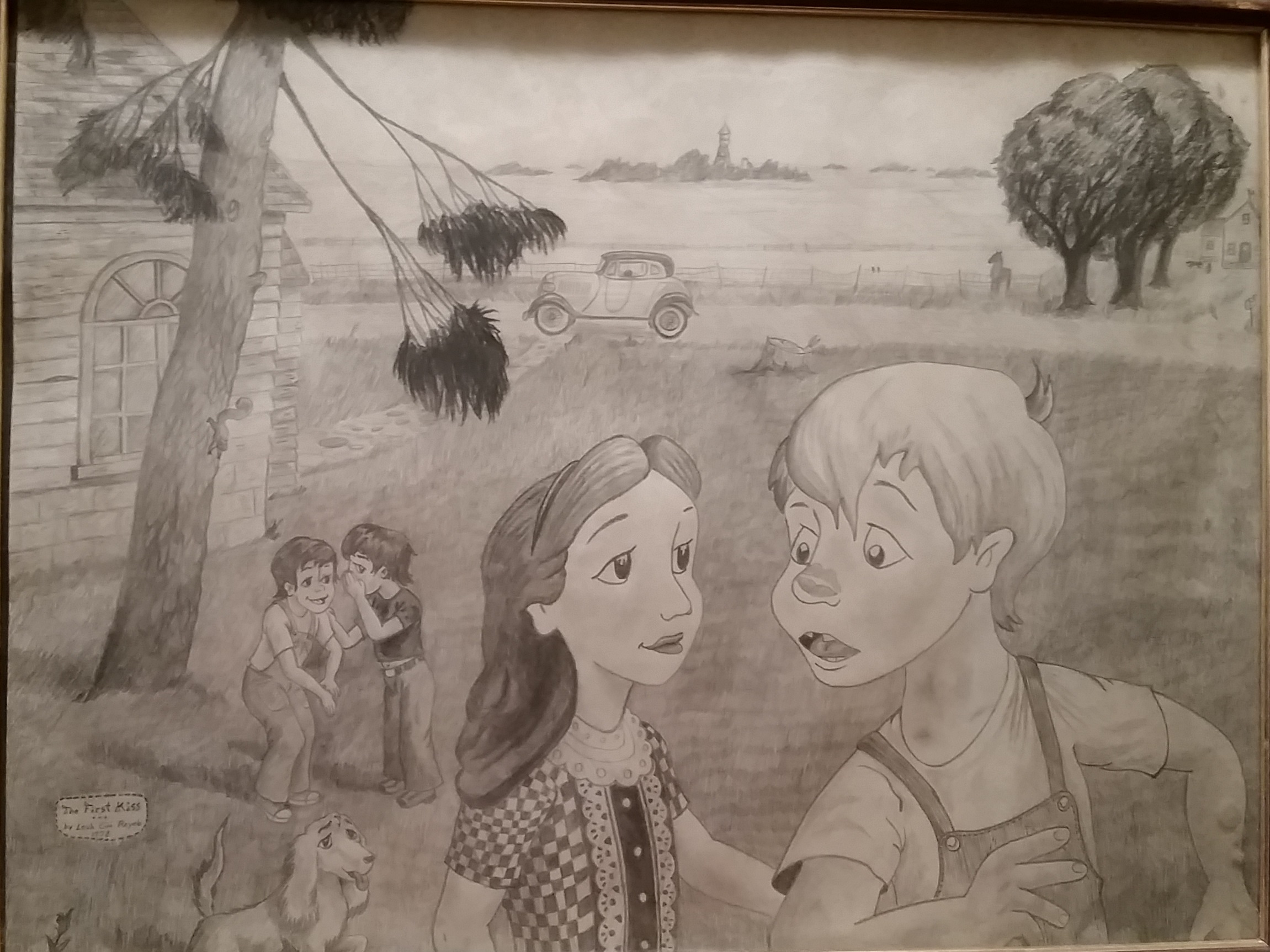
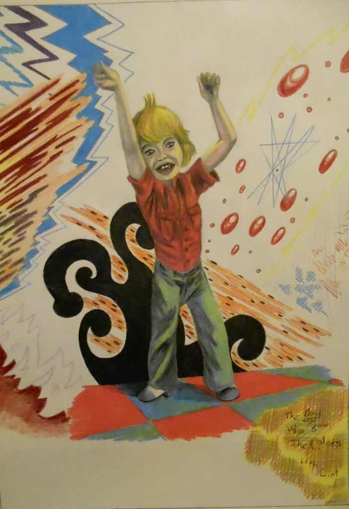
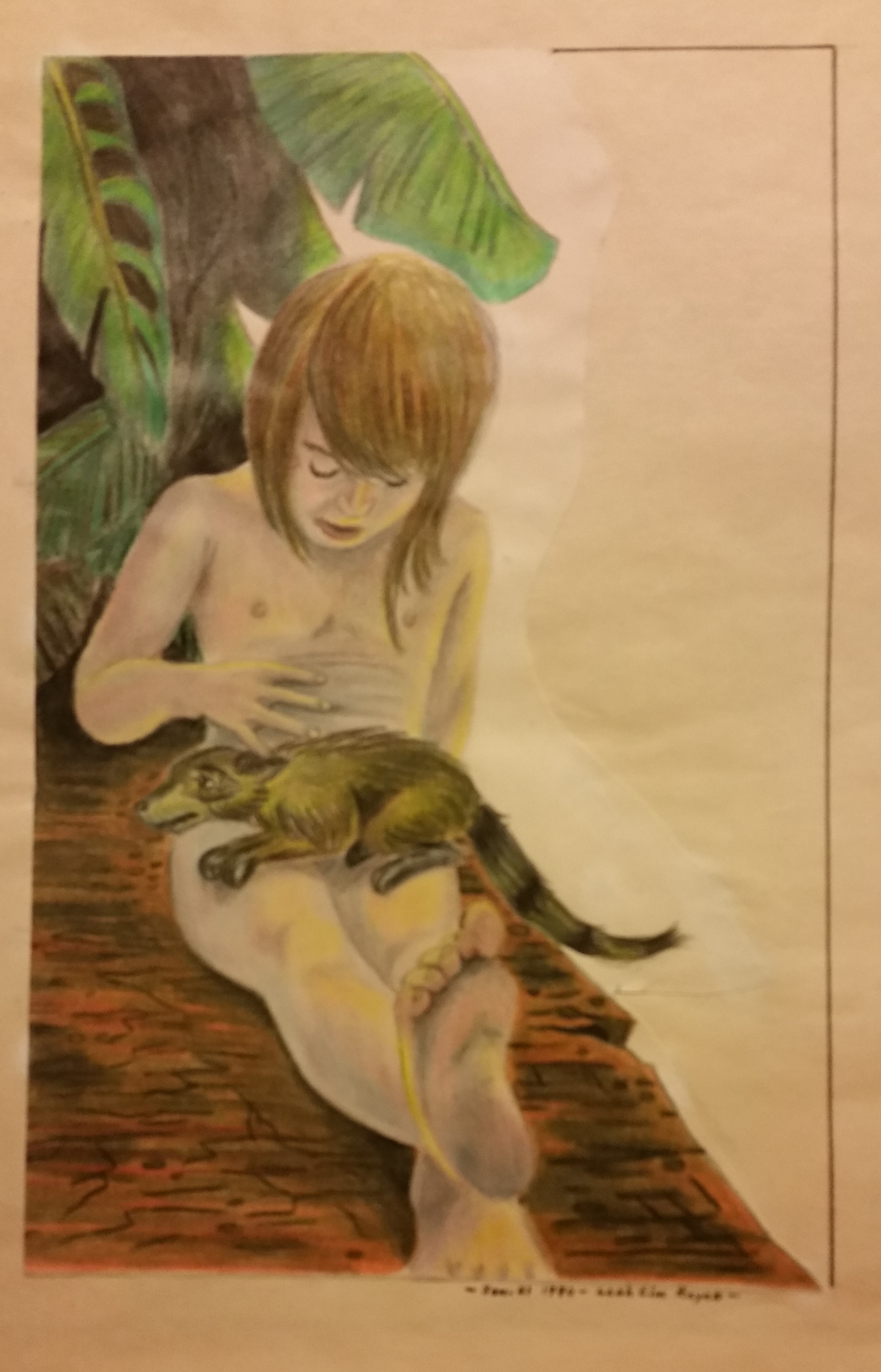
This drawing was done on the front porch in the house in Rowan. It would be years before mom framed it. It is another example of what I could do as a high school kid. In fact, I composed it from art-class sketches I did my senior year in school.
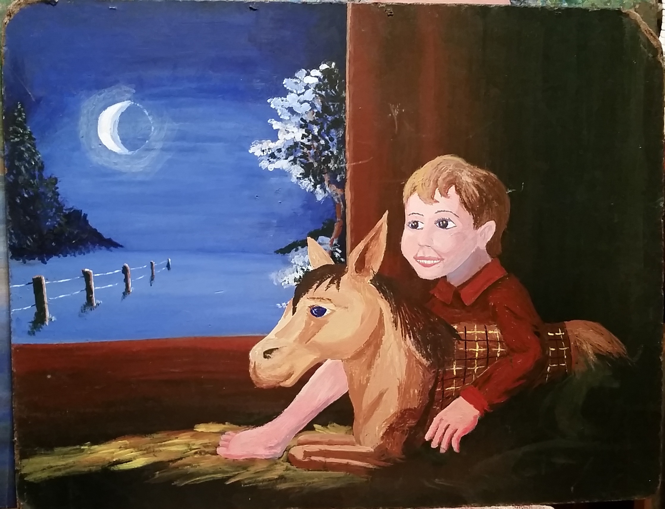
The Boy in the Barn was painted on the remains of an old chalkboard that my sisters, brother, and I had used in grade school.
Grandma Aldrich asked for this picture to hang over the sofa in the farmhouse living room. It stayed there for many years.
Great Grandma Hinckley passed away in 1980. I created this portrait from a combination of photos and memory. It was too good. It was never hung anywhere because it always made her daughter, my Grandma Aldrich, tear up.
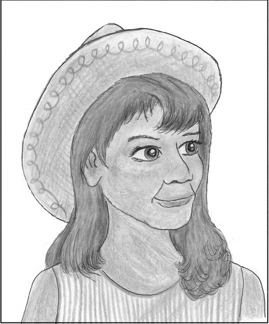
This pencil drawing won a blue ribbon at the Wright County Fair in the late 70’s.
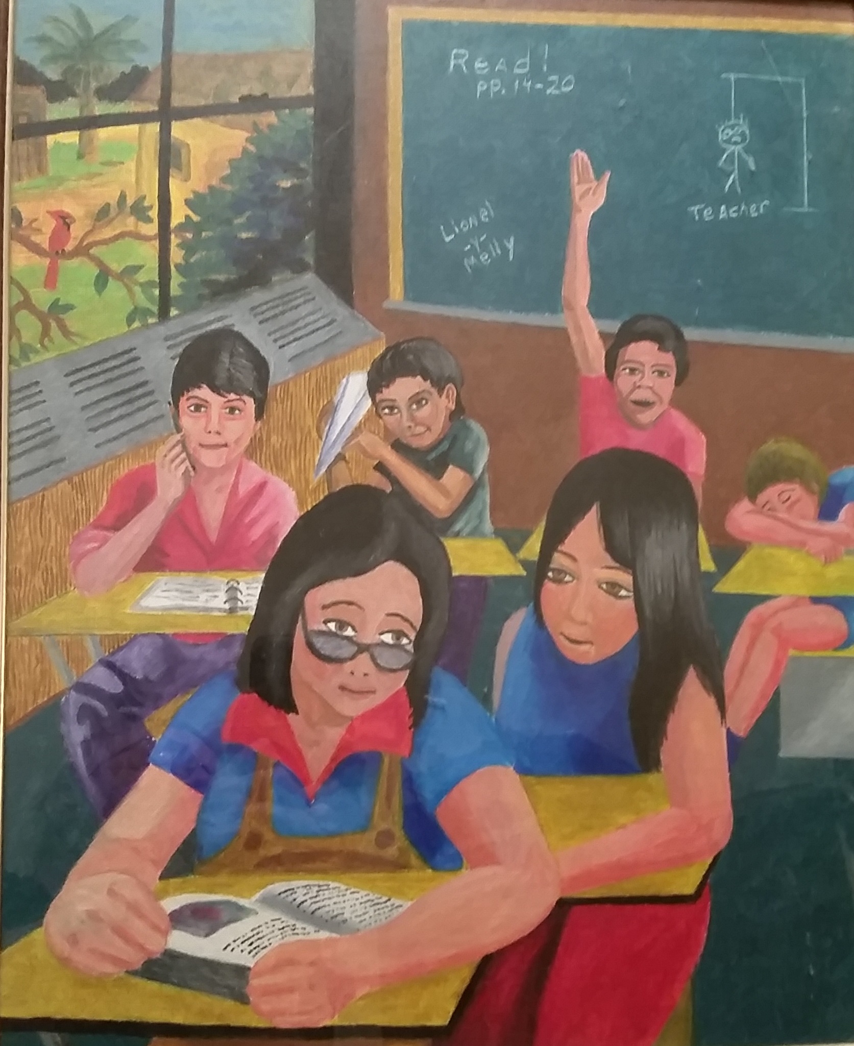
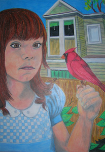
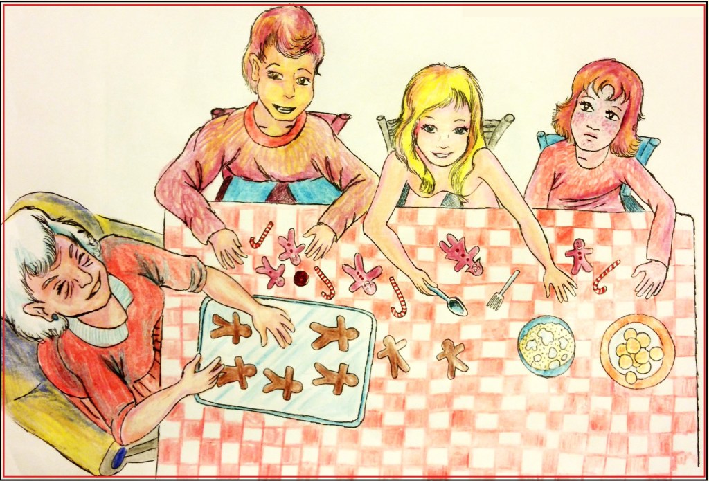
This picture is called First Years are Hard Years. It was painted in 1982 after my first year of teaching at the junior high school in Cotulla, Texas. I painted mostly the good kids. The girl on the lower right would later go on to become a teacher for our school district. I can’t claim to be the one who inspired her, but she did make straight A’s in my class.
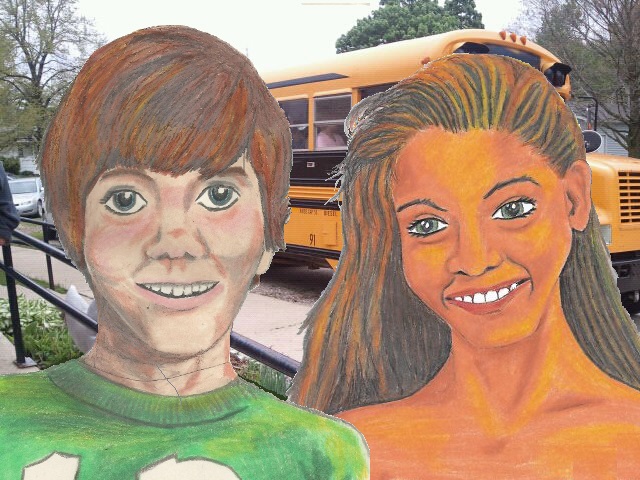
This is called Beauty. It is done in oil crayon on canvas. I did it for my mother to hang in the hallway in the house in Taylor, Texas.
So, it turns out, I unearthed art treasures by searching for the one painting.


True Treasures Take Time
I now have six good books and one embarrassing one published. They represent stories I have been crafting, revising, telling, and retelling for over 40 years. They represent things that happened to me in real life and people I have known and loved in real life that have all been transformed in the wizard’s crucible and witch’s cauldrons of my bizarre imagination. They contain some of my best magic spells and some of my most worthwhile wordsmithing, by which I mean writing in ways that give the spellchecker fits.
I tried to tell you this story about telling stories yesterday, but my computer glitched and burped and spontaneously deleted more than half of what I wrote just as I was finishing it to publish it. So the complex part I had planned to explain this Paffooney was lost and the resulting tantrum I threw kept me from remembering and rewriting.
But it was fortunate that I delayed the repair of this post until today. Because last night my daughter finished her end-of-the-year art project for school, and the snafu-demons have inadvertently given me the opportunity to include it here.
It is a soft sculpture dragon made of felt and hand-sewn. She didn’t tell me what his name is, or even that it is a him, but one can imagine that it must be something like Rumple-Tum Sneezer, or something equally awkwardly foolish like that. One can imagine it because one has a slightly off-kilter and Disney-demented imagination. But the whole project took a boatload of time, and you can see she crafted it with great care and skill.
Treasure takes time to create. We who attempt to create it in the red-hot forges of our stupid little creative heads put all the skill we have acquired over time into it. And the endeavor renders something of value almost every time. Time… time… time… Treasure takes time. And now I need to hurry and publish this before the computer tries to fart it all away again.
Leave a comment
Filed under artwork, Celebration, commentary, daughters, humor, imagination, Paffooney, strange and wonderful ideas about life
Tagged as books, family, fiction, life, writing