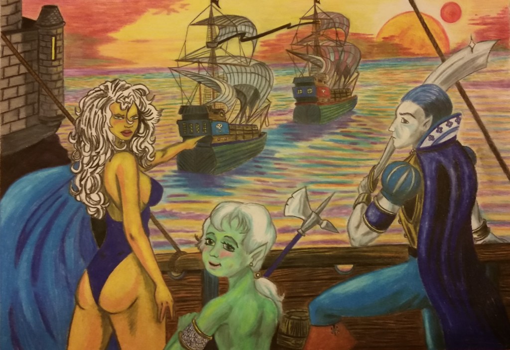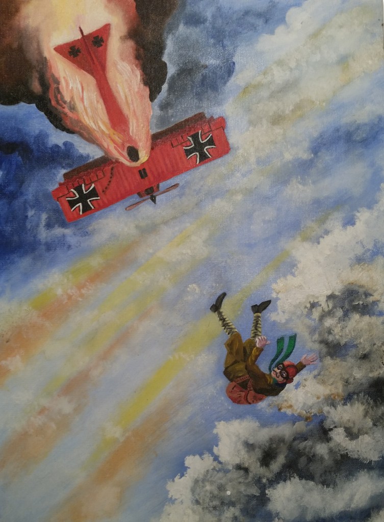
The three primary colors of paint are red, yellow, and blue. Together with the neutrals, white and black, these colors can be mixed to make any other shade, tone, or hue that exists on the color wheel and can be perceived by the human eye. When all three are present in a painting, it inherently has a feeling of completeness, wholeness, and balance.
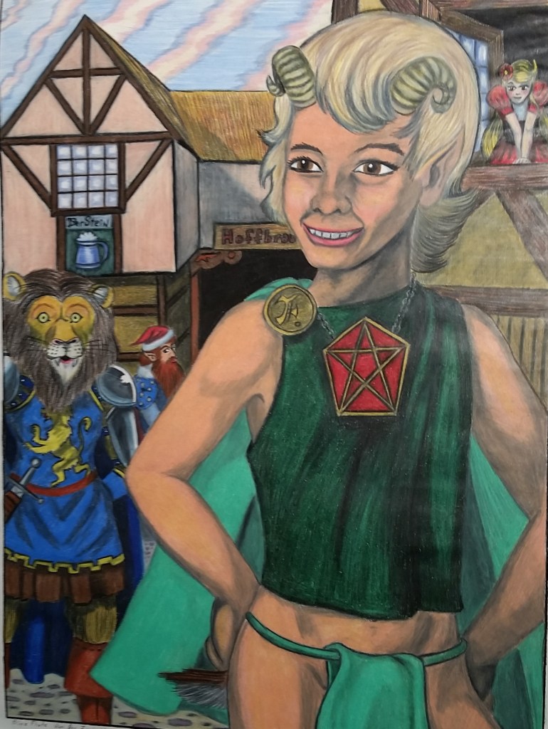
How those primaries are mixed, allowed to dominate, or allowed to recede does a lot to determine the feeling the artwork projects into the viewer’s mind.
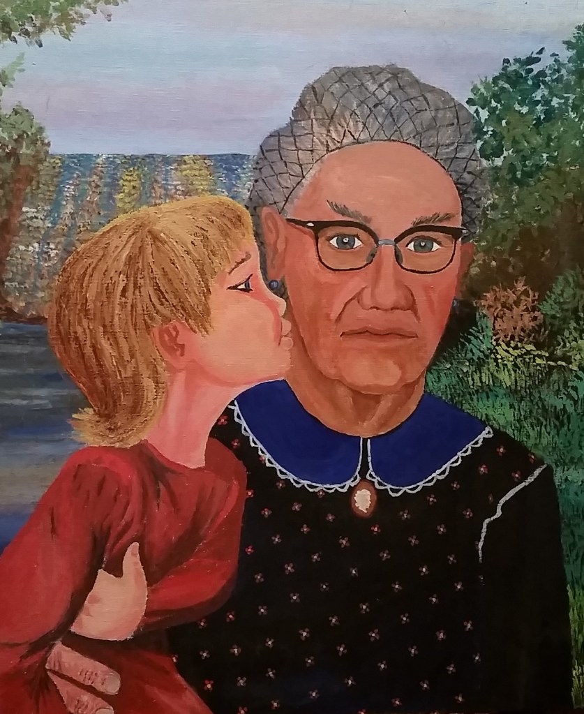
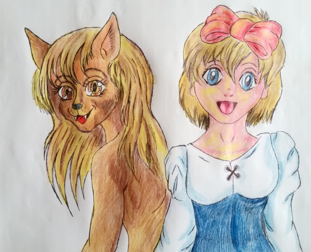
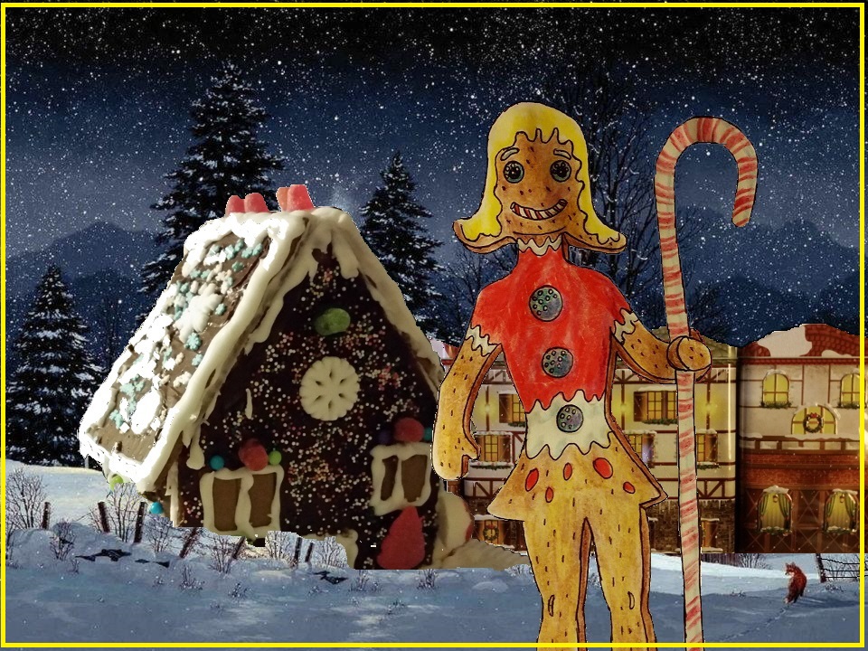
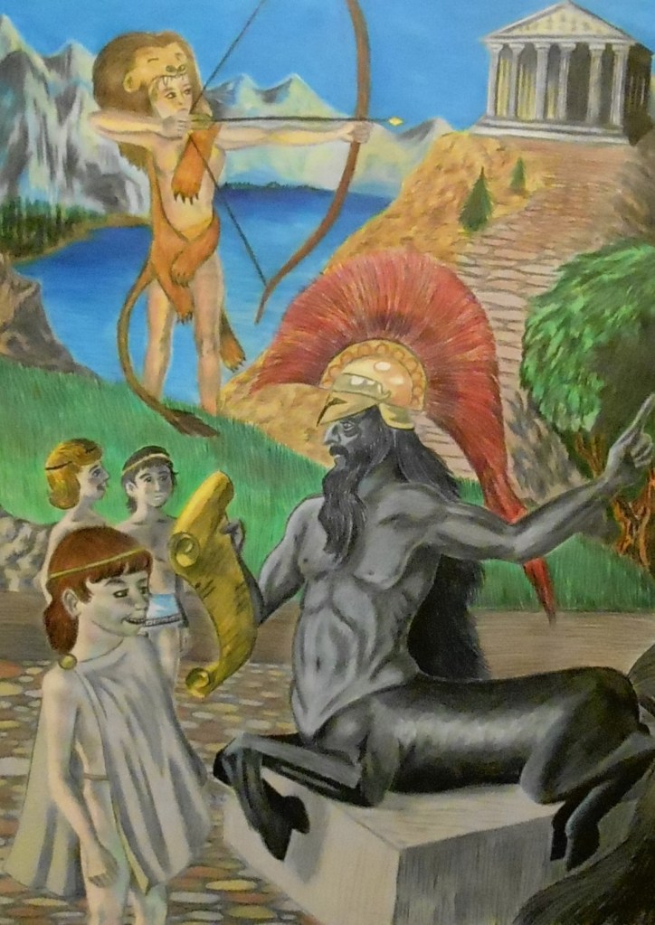
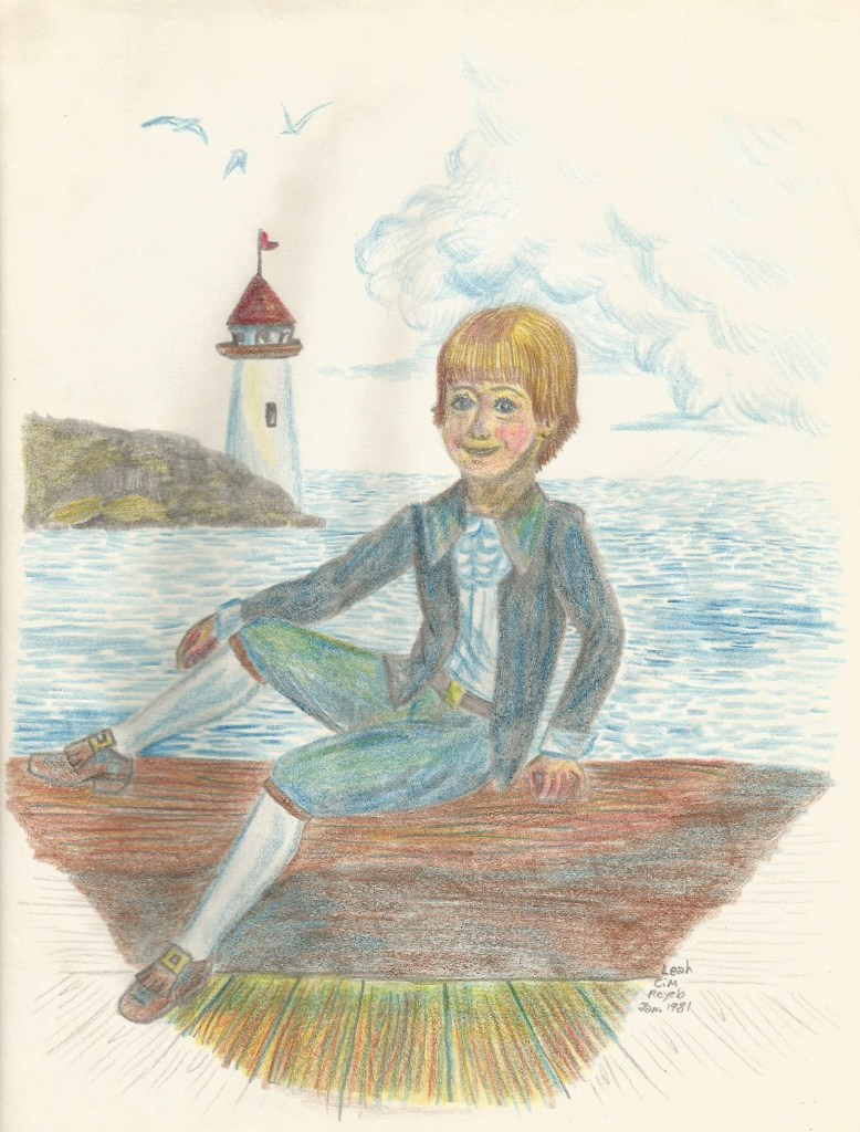
All of the artworks I am showing you today haven’t appeared in my blog for some time. But all of them are interpreted in primary colors. I won’t tell you how each picture is supposed to make you feel. I am just the artist. Only you can prevent forest fires, and only you can interpret a painting and tell someone else how it makes you feel.