
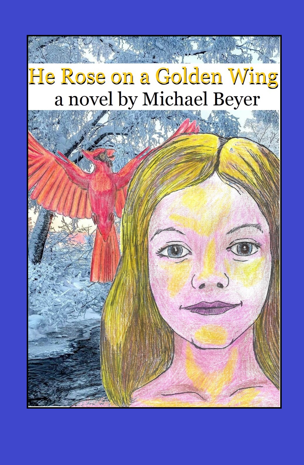
The cover I have been using for my current work in progress has some flaws in it. As you can probably see better than I can (because I am becoming increasingly colorblind,) the golden glow I tried to put on Valerie’s face with colored pencil is too heavy-handed, not subtle enough. So, I tried to smooth it out and blend it with the Windows Paint program. I also needed to do something about the blue frame and the rather wide title banner. The Amazon KDP Cover Creator has a tendency to cut off words and details if you are not careful enough about the distance between words and images that you need to appear on the cover and the potential edge of the cover. And I decided to use white over blue because the book is about battling suicidal depression. White is a more hopeful and positive color than blue which is usually associated with sadness and negative emotions. And I want this book to be an answer for depression, not a cause of it.
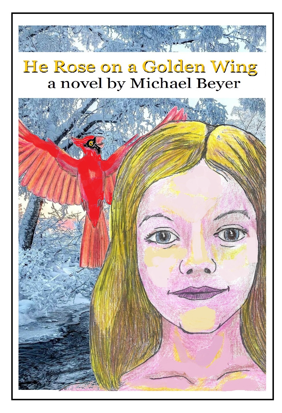
The cover probably still needs work. But I think it is getting better. You are certainly welcome to disagree, and the comments are open for you to say so. Input is a good thing, even if it is insulting. After all, no matter what else happens, some readers are going to hate this book. I hope more will love it.
