
I am the first to admit, I don’t know diddly-sqwoot about effective cover design. But now, with self-publishing as the only option left to me, I am learning things about publishing that I only ever scratched the surface of in my few college forays into publication design and layouts. I had some experience publishing junior high yearbooks, (and losing money on something that most teachers lose money on). And I have gotten a lot of serious criticism from sources that matter to me, like my daughter, the Princess.
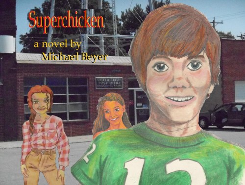
With the novel I have been working on with Kindle Publishing on Amazon in view, I came up with this. I like it. But it will not cut the mustard with the Princess. (She uses a knife on mustard, but lately has given up on eating mustard all together). So I had to work the idea out further.
I tried this;
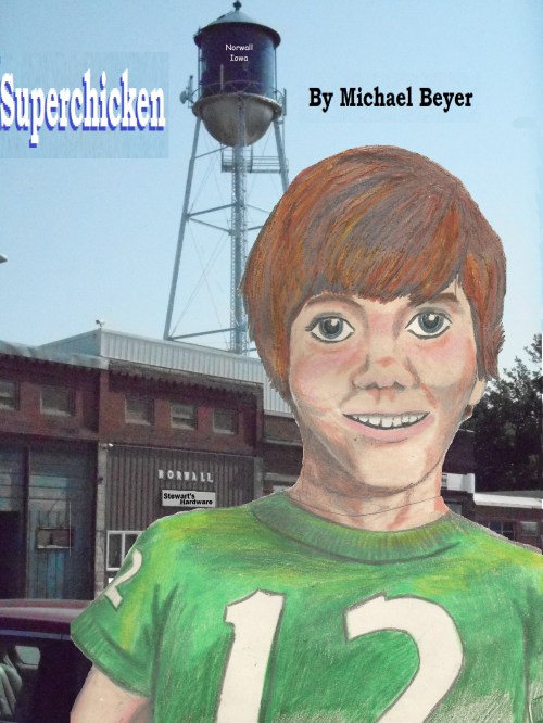
The design is a little better. But Rowan has become so ratty and run down that I hesitate to use the background which is not much like the Rowan of 1974 when the novel was set. So I decided to focus on character instead.
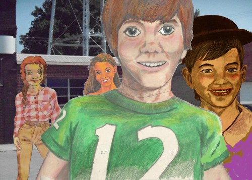
Still needs work, right? You can no longer see the post office sign in the background. Sherry is still a small head growing out of Superchicken’s neck. And Milt Morgan is a good addition, but the purple paisley shirt looks terrible. And besides, this will not fit the whole cover of the Kindle paperback.
It will end up looking something like this;
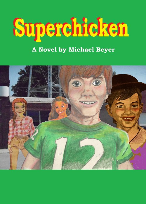
Or not. Because I am still learning how to do it right, and I still have many more mistakes to make. But as I finish editing and formatting, the time will come soon to see the proof in the pudding. (And you better hope I don’t put uncut mustard in the pudding. That would taste terrible.)
